

Research Questions and Hypothesis
In 2020, cities and nations across the world have implemented various policies and restrictions to prevent and contain the spread of COVID-19. However, the types of containment strategies, the strictness of implementation, and observation by the community vary (Lasry et al. 2020). While the United Kingdom and Australia issued restrictions to non-essential travel in the form of stay- at-home orders, India enforced a complete lockdown on 1.3 billion people. In the United States, restrictions were set by either state or city officials. We hypothesize that the effect of these interventions is measurable with people’s daily movement, which is accessible through navigation app providers such as Apple, Google, and Citymapper (Paez 2020).
This article explores opportunities for using Mobility Trends Reports published by Apple to assess the impact of government policies to COVID-19 on mobility changes in cities. The following research question is examined:
- How do differing public policies and restrictions impact changes in mobility patterns? And, whether the patterns significantly vary across global regions?
Methods and Data
We selected the regions of London, England; Sydney, New South Wales; Phoenix, Arizona; and Pune, Maharashtra to analyze the changes in urban mobility due to COVID-19. The four regions were chosen to provide a diverse understanding of the COVID-19 policies on mobility patterns in different global regions. These regions each have a different timeline of COVID-19 related policy events, and various types of urban form, transit usage and travel patterns, which provides an opportunity to study how mobility is impacted in varied contexts. Our goal was to build a sound methodology approach to analyze the four cities that can be applied to a range of other cities.
The Apple Mobility Trends Reports (AMTR) provide daily aggregated and anonymized data on the relative volume of requests for directions on Apple Maps per country/region, sub-region, or city compared to a baseline volume on January 13, 2020. The baseline date was chosen by Apple considering it was a fortnight before the WHO declared COVID-19 as a “Public Health Emergency of International Concern” (PHEIC) on January 30, and hence it excludes the effect of any national or local shelter in place orders, which followed the WHO advisory. Days are defined as midnight-to-midnight, Pacific time in the AMTR data sourcing framework. We validated the AMTR data in relation to Google Community Mobility Reports (GCMR) to assess how closely the Apple data matched real movement changes. There is a strong similarity between the two datasets (Baily 2020). For example, Apple reported an 87% drop in driving in the city of Pune for March 25, a day after the nation-wide lockdown started in India. For the same day, GCMR reported 88% drop in movement related to retail and grocery and 86% drop in travel to workplaces.
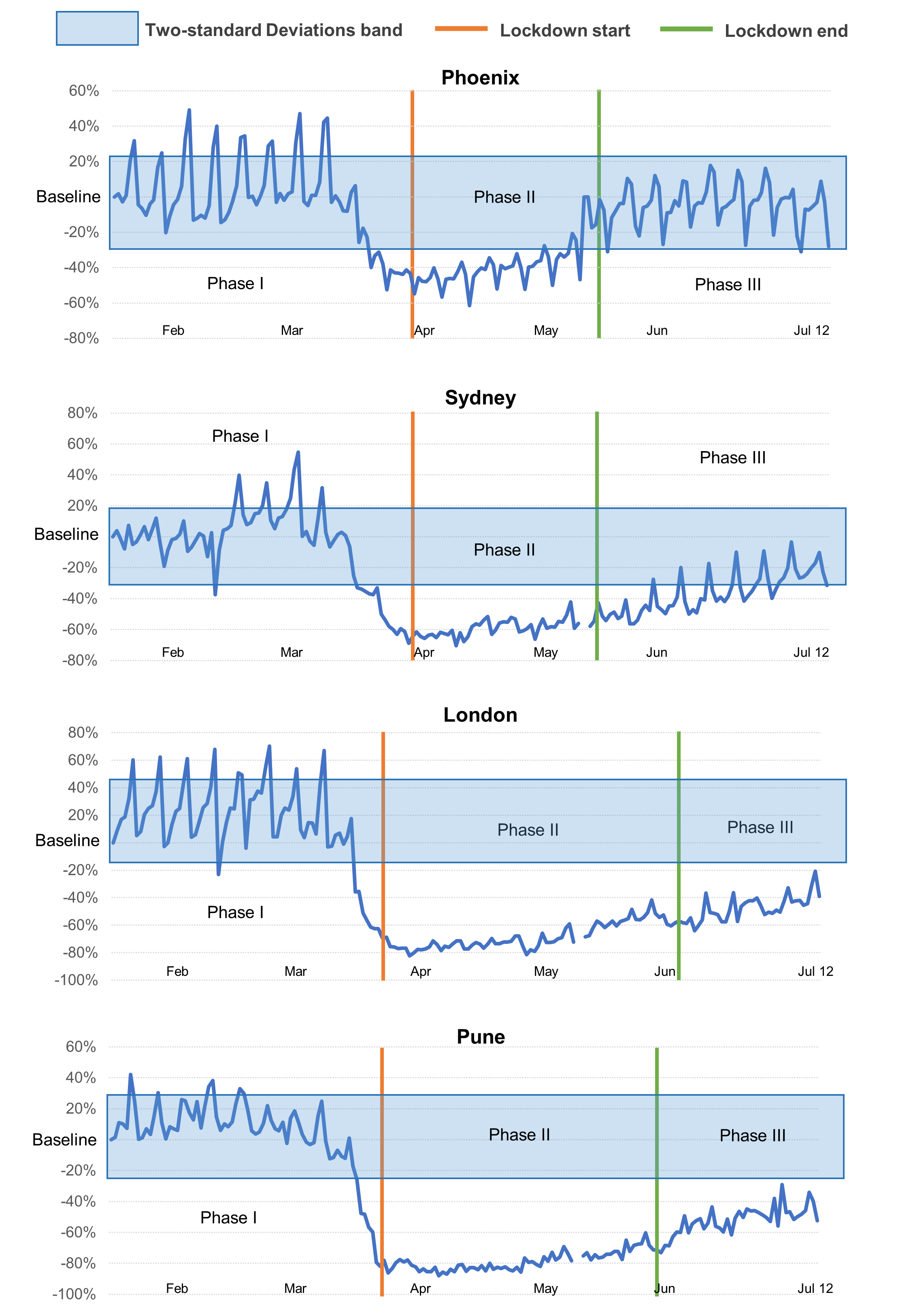
We calculated the AMTR data as a daily percentage increase or decrease in movements between January 13 and July 12, 2020, while keeping the baseline median value of mobility at 100 corresponding to January 13. We then divided the data into three phases for this analysis, Phase I is the pre-lockdown period, before implementing stay-at-home and lockdown interventions. Phase II refers to the lockdown phase when the mobility restrictions were in effect. Phase III includes data samples for the period after the lockdown intervention was removed. We performed a two-standard deviation (2-SDs) band statistical analysis, also known as ‘Shewhart chart’ (Begun 2018) to measure the degree of changes in mobility between lockdown phases, and P-value significance was tested with a nonparametric technique. The method is popularly used in social science research where the data are related to what happens within a single system (Nugent 2010), in this case, individual mobility. We visualized the data to provide an understanding of the trends according to travel mode (driving, transit, walking) and region. Data for 11-12 May is not available from AMTR, and transit movement information is not reported for Pune and was dropped from the analysis.
Findings
Figure 1 illustrates the government responses to COVID-19 with the changes in people’s movements across Phoenix, Sydney, London, and Pune. We find that trip requests declined before restrictions were issued in the respective regions. While Phoenix and Sydney experienced a gradual decline in people’s movements across the different transport modes, Pune shows a radical plunge a week before the announcement of the COVID-19 lockdown restrictions. On Monday, March 30 following the Indian government’s March 24 announcement of the nation-wide lockdown, driving in Pune had fallen by 88%. Whereas Sydney and Phoenix saw a reduction in routing requests on Apple Maps by 46% and 43% respectively on Monday, April 6 after the stay-at-home orders were issued on March 30. In all places, the collapse in demand for mobility preceded the issuance of travel restrictions and the nadir of travel requests occurred as the restrictions went into effect.

To test for differences in mobility trends from different policy phases, we computed the mean, median and standard deviations in each phase, then drew a “band” representing two standard deviations (2 SDs) around the baseline mean onto the graph. The 2-SD band is computed from the baseline period (Phase I) data. Figures 2 and 3 present the analysis graph, also known as Shewhart chart, which helps us determine where the intervention phase (See Phase II on Figure 2, 3) data points fall in comparison to that “band.” According to Gottman and Leiblum (1974), if at least two consecutive data points in the intervention (Phase II) and post-intervention (Phase III) period fall outside the band, a significant change was observed from baseline (Phase I). The vertical orange line over the graphs indicate the date from which the lockdown was in force, and the vertical green line highlights the end of the lockdown period. Table 1 provide the descriptive statistics (mean, median and N) for driving and walking by mode, and Figure 2 and 3 shows how the 2-SD band looks like across the four cities.


It is evident that individuals’ driving and walking patterns in all four regions changed substantially, as we find several instances of two consecutive data points falling outside the 2-SD band during the most restrictive phase (Phase II). However, Phase III, after restrictions were lifted, show variation among the four regions. Trip requests in Phoenix and Sydney increased after lockdown interventions were lifted, with a high-majority of data points fall within the 2-SD band for both driving and walking modes. On the contrary, upward changes in mobility in Pune and London in Phase III were not significant as most data points were outside the 2-SD band. Some of this can be attributed to Pune being the worst affected district in India in terms of total COVID-19 infections, suppressing demand for travel.
We also conducted a nonoverlap of all pair (NAP) analysis based on probability: the Mann-Whitney U-test to examine whether the mobility changes among the pairs of observations between phases were statistically significant. NAP has good power efficiency–about 91-94% that of linear regression for “conforming” data, and greater than 100% for highly skewed, multi-modal data (Parker and Vannest 2009). The results presented in Tables 2 and 3 support the visual analysis in the Figures and show that the changes in mobility between Phase I and Phase II are statistically significant for all four cities (p<.05). In other words, there appears to be a statistically significant decrease in mobility during the lockdown phase comparative to the pre-lockdown period (see Z values are negative for Phase I vs Phase II). The tables also show that mobility has recovered significantly in the post-lockdown phase (Phase III) relative to the lockdown period (Phase II) for the four cities, (see p<.05, and high-positive Z values for Phase II vs Phase III). Importantly, when mobility data for Phase III is compared with Phase I, we find that trip requests for driving in Sydney and walking in Phoenix have not recovered significantly (p>05). Although, we see a significant change (p<.05) in walking trip requests in Phoenix for Phase III vs Phase I, the degree of fall is marginal with a Z value of -0.37. These findings indicate that while mobility drop-off began in the similar time period, communities across the four cities have responded to policy changes differently, and the lifting of lockdown restrictions did not reverse the trend of falling trip requests in all cities.
This article illustrates how aggregated mobility statistics can help measure the effects of government policies and containment strategies on people’s movement due to the COVID-19 pandemic. While the degree of mobility changes at a particular period should not be studied in isolation from the actual rate of infections, the analysis provides evidence that there are significant variations across four cities on the immediate response by people to the lockdown and social distancing orders by the authorities. By doing so, the article provides a clue to the mobility behavior in different global regions, and the power and significance of messaging by the governments in dealing with a humanitarian crisis. The analysis approach presented in this article provides a snapshot of four cities but could be applied across many more urban areas and regions.
Acknowledgments
The authors would like to acknowledge funding from the PLuS Alliance. We also thank the anonymous reviewers for their constructive feedback during the peer-review process.